반응형
지금 파이썬으로 하려고 하는것은 여러 데이터를 그래프로 시각화시켜줘야 한다. 무엇보다 서로 다른곳에서 가지고 온 정보 싱크를 맞춰줘야 한다.
data1은 초당 5000개의 데이터를 가지고 오고, data2는 초당 10개 남짓 가지고 온다고 했을 때, 듬성 듬성 잘 맞춰줘야 비교할 수가 있다.
x축을 시간으로 보고 아래와 같이 sharex 를 통해 x축을 share(공유)하겠다고 하면 나머지는 matplotlib가 다 한다.
x_1과 x_2가 실제 x축 데이터이다. 측정된 시간도 다르고 무엇보다 개수도 다르다.
#reference link
##https://stackoverflow.com/questions/62783909/matplotlib-set-data-not-showing-a-line
import numpy as np
import matplotlib.pyplot as plt
import matplotlib.patches as patches
import matplotlib.gridspec as gridspec
import random
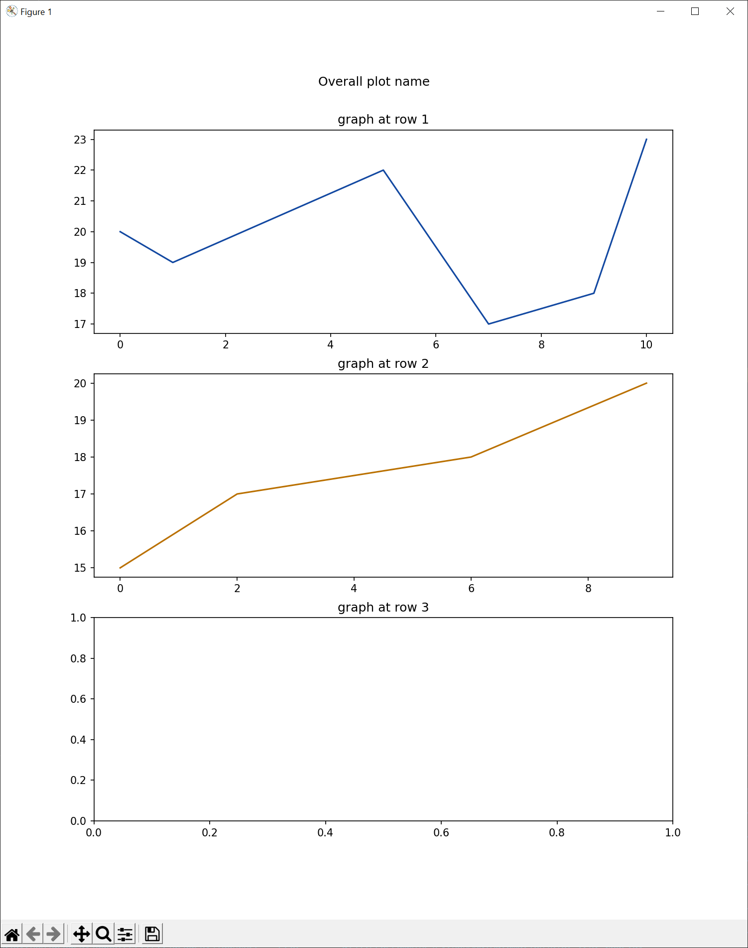
x_1 = [0, 1, 5, 7, 9, 10]
y_1 = [20,19,22,17,18,23]
x_2 = [0, 2, 6, 9]
y_2 = [15,17,18,20]
def figure_axes_example():
#initial grid size with 3rows and 1 column
gs = gridspec.GridSpec(3, 1)
plt.close('all')
plt.ion()
fig = plt.figure(figsize=(10, 12))
fig.suptitle(f'Overall plot name', y=0.94)
graph_row_1 = fig.add_subplot(gs[0, 0])
graph_row_2 = fig.add_subplot(gs[1, 0], sharex=graph_row_1)
graph_row_3 = fig.add_subplot(gs[2, 0])
graph_row_1.set_title("graph at row 1")
graph_row_2.set_title("graph at row 2")
graph_row_3.set_title("graph at row 3")
graph_row_1_line, = graph_row_1.plot([], [],
label='line1',
color='#1248a1')
graph_row_2_line, = graph_row_2.plot([], [],
label='line2',
color='#ba7000')
graph_row_1_line.set_data(x_1, y_1)
graph_row_2_line.set_data(x_2, y_2)
graph_row_1.relim()
graph_row_1.autoscale_view()
graph_row_2.relim()
graph_row_2.autoscale_view()
plt.show()
fig.canvas.draw()
name = "testing"
# replotting with different grid size is possible.
# close previous and create new figure and grids
plt.close('all')
plt.ion()
gs = gridspec.GridSpec(2, 1)
fig = plt.figure(figsize=(10, 12))
fig.suptitle(f'Overall plot name', y=0.94)
graph_row_1 = fig.add_subplot(gs[0, 0])
graph_row_2 = fig.add_subplot(gs[1, 0])
plt.show()
name = "sencond"
if __name__ == '__main__':
figure_axes_example()
하지만 그래프를 그려보면 싱크가 잘 맞춰진 것을 확인할 수 있다.

sharex를 빼면 아래와 같이 틀어지게 된다.
반응형
'공부하며놀자 > 프로그래밍' 카테고리의 다른 글
| [python][pytube] youtube 영상 다운로드 (1) | 2022.10.19 |
|---|---|
| [python][pyqt5] pip3 install pyqt5-tools failure 설치 에러 실패 (2) | 2022.10.18 |
| [python][matplotlib] 파이썬에서 그래프 그리기 plot graph (0) | 2022.10.17 |
| [Python] logging logger 관련 내용 (0) | 2022.09.08 |
| [C#]Abstract class (0) | 2022.04.27 |


댓글